

Five palettes cover most of what you need: Star Wars logo, Jedi, Sith/Empire, Rebel Alliance, and First Order. Each one below comes with hex and RGB values you can paste straight into a swatch library, plus a flag on whether the color is an official brand value or a close approximation pulled from screenshots and production stills.
The one confirmed, non-approximated value in this whole guide is the Star Wars logo itself: Solid Yellow #FFE81F (RGB 255, 232, 31) against pure black #000000. Everything else, from lightsaber glow to Tatooine sand, is a reasonable approximation because Lucasfilm doesn’t publish official hex codes for planets or factions.
-
Star Wars logo:
#FFE81F(255, 232, 31),#000000(0, 0, 0) -
Jedi:
#3A6EA5(58, 110, 165) steel blue,#5B7F53(91, 127, 83) muted green,#C9A876(201, 168, 118) desert tan -
Sith/Empire:
#8B0000(139, 0, 0) blood red,#1C1C1C(28, 28, 28) charcoal black,#4A4A4A(74, 74, 74) gunmetal gray -
Rebel Alliance:
#E8A33D(232, 163, 61) flight-suit orange,#B0B7BF(176, 183, 191) X-wing gray,#1B1F23(27, 31, 35) deep navy black -
First Order:
#0D0D0D(13, 13, 13) black,#B22222(178, 34, 34) sigil red,#8C8C8C(140, 140, 140) trooper gray
To export any of these, drop the hex codes into Adobe Color’s custom palette builder, paste them into Coolors as a URL string, or create a Figma style library with each swatch labeled by name and provenance.
Key Takeaways
Star Wars color palettes work as design tools when you pair accurate hex codes with the franchise’s core principle: muted bases, bold accents, and color-coded allegiance.
| Point | Details |
|---|---|
| Only the logo is official | Solid Yellow #FFE81F and black #000000 are confirmed brand values; every other palette here is a documented approximation. |
| Muted bases beat saturation | Original trilogy costuming favors earth tones for heroes and black/gray for villains, not fully saturated primaries. |
| Color signals allegiance | Doug Chiang’s design principles rely on bold, simple color-coding so silhouettes read clearly at a glance. |
| Texture completes the look | The used-future aesthetic pairs restrained color with weathering and grit, not color alone. |
| Test before printing | Fabric color and ink opacity shift how hex codes render, so a small test swatch beats guessing. |
Table of Contents
- Star Wars Color Palettes You Can Use Right Now
- What Do Lightsaber Colors Actually Mean?
- Which Colors Define Star Wars Planets and Locations?
- How Does Lucasfilm Actually Use Color?
- How Do You Apply These Palettes to Your Own Designs?
- Where Can You Download These Palettes?
- How Do You Combine Palettes for a Cohesive Design?
- A Practical Note on Fan Apparel
- Frequently Asked Questions
- Sources
Star Wars Color Palettes You Can Use Right Now
Beyond the five core sets above, most fan design work draws from a broader library of faction and franchise colors. The table below breaks down primary values, RGB equivalents, and where each color earns its keep in a design.
| Palette | Hex codes | RGB | Best use |
|---|---|---|---|
| Star Wars logo | #FFE81F, #000000 | (255, 232, 31), (0, 0, 0) | Wordmarks, title cards, primary logo work |
| Jedi | #3A6EA5, #5B7F53, #C9A876 | (58,110,165), (91,127,83), (201,168,118) | Calm hero palettes, robe textures, poster backgrounds |
| Sith/Empire | #8B0000, #1C1C1C, #4A4A4A | (139,0,0), (28,28,28), (74,74,74) | Villain accents, dark apparel bases, dramatic lighting |
| Rebel Alliance | #E8A33D, #B0B7BF, #1B1F23 | (232,163,61), (176,183,191), (27,31,35) | High-contrast tees, insignia graphics, action posters |
| First Order | #0D0D0D, #B22222, #8C8C8C | (13,13,13), (178,34,34), (140,140,140) | Minimalist dark-mode UI, stark faction badges |
Every value except the logo is an approximation drawn from on-screen material rather than an official brand guide, and that distinction matters for anyone building a portfolio piece they want to defend as “accurate.” The galactic style guide analysis of original trilogy costuming backs this pattern up: heroic characters lean on muted earth tones, villains lean on black and gray, and nobody in the classic films wears a fully saturated primary color as a base.
Sith reds and First Order grays often look muddy on dark fabric until you bump the saturation slightly for print.*
What Do Lightsaber Colors Actually Mean?
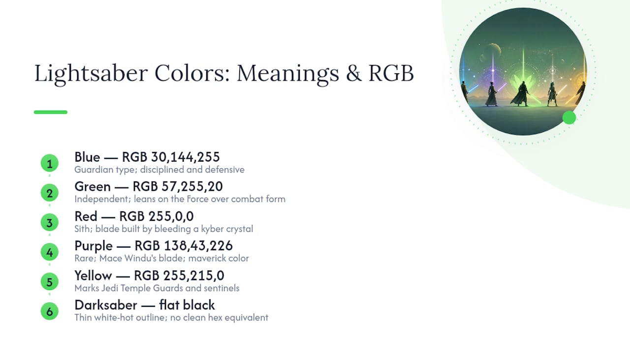
Blue and green mean Jedi, red means Sith, and everything else marks a character who broke from tradition. Blue (#1E90FF / RGB 30, 144, 255) signals a guardian type, disciplined and defensive. Green (#39FF14 / RGB 57, 255, 20) reads more independent, often tied to Jedi who lean on the Force itself over combat form.
Red (#FF0000 / RGB 255, 0, 0) belongs to the Sith and marks a blade built by bleeding a kyber crystal, an act of corruption baked into the color itself. Purple (#8A2BE2 / RGB 138, 43, 226), famously Mace Windu’s blade, sits outside canon explanation in most material and works as a fan-favorite “maverick” color precisely because it’s rare. Yellow (#FFD700 / RGB 255, 215, 0) marks Jedi Temple Guards and sentinels, a documented but less common variant.
The Darksaber breaks the pattern entirely: a flat black blade with a thin white-hot outline, no clean hex equivalent because its glow effect resists standard swatch treatment. Treat it as a special case, built from layered strokes rather than a single fill.
Which Colors Define Star Wars Planets and Locations?
Tatooine, Hoth, Endor, Mustafar, and Coruscant each carry a signature palette strong enough to anchor a poster or an apparel print on its own.
-
Tatooine:
#D9A566sand,#8B6F47clay brown,#F4E4BCbleached bone,#3D5A80twin-sun sky blue. Works well as a warm background texture or distressed-tee base. -
Hoth:
#E8F1F8snow white,#A8C5D6ice blue,#5C6B73storm gray,#0D1B2Anight navy. Suited to cold, minimal designs and high-contrast winter apparel drops. -
Endor:
#2D4A2Bdeep forest green,#4A6741moss,#6B4423bark brown,#8FA382fog green. Reads well in nature-themed fan art and earthy merchandise. -
Mustafar:
#FF4500lava orange,#1A1A1Avolcanic black,#8B2500scorched red,#4A4A4Aash gray. Built for dramatic, high-contrast poster work. -
Coruscant:
#2C3E50skyscraper blue,#F39C12window-light amber,#95A5A6steel gray,#1A1A2Enight sky. Ideal for cityscape UI mockups and sci-fi backgrounds generally.
Pro Tip: Pair a location palette with a faction accent for depth. Rebel orange dropped into a Tatooine sand background, for instance, reads as “desert rebellion” without any extra imagery.
How Does Lucasfilm Actually Use Color?
Color in Star Wars isn’t decorative. It’s a signaling system that lets an audience read allegiance and stakes at a glance, even in a crowded frame. Doug Chiang’s four design principles call for bold, high-contrast silhouettes and deliberate color-coding so a viewer instantly knows who’s who before a single line of dialogue lands. That’s the same instinct that makes a Rebel orange flight suit pop against an Imperial gray corridor.
Roger Christian’s account of building props and sets for the original film backs up why the palettes above skew muted rather than glossy. Nothing on the Millennium Falcon was meant to look new.
The “used-future” philosophy treats color as secondary to weathering and material honesty. A blaster or a control panel earns its look through scuffs and grime, not a fresh coat of paint, and that same restraint is what separates a Star Wars palette from a generic sci-fi one.
For apparel and fan art, the takeaways are practical:
- Keep saturation controlled on base colors; save full intensity for one or two accents.
- Add texture or grain in the design file, since flat color alone reads as too clean.
- Prioritize silhouette and readability over decorative detail, especially at small print sizes.
Pro Tip: Layer a subtle grain or scratch texture over your base palette before printing. It preserves that lived-in Star Wars look without hurting legibility on a shirt viewed from six feet away.
How Do You Apply These Palettes to Your Own Designs?
Contrast and legibility come first. A palette that looks great on a monitor can fall apart on a heather-gray tee if you haven’t tested it against real fabric.
- Run your primary text and background combination through a contrast checker; aim for at least a 4.5:1 ratio for any readable text, matching standard WCAG accessibility guidance.
- Label every approximated color in your file (a comment layer works fine) so nobody downstream mistakes it for an official value.
- Preview the design mockup on both a white and a black garment; Sith reds and First Order grays shift more than you’d expect under different base fabrics.
- For glow effects like lightsabers or the Darksaber’s outline, use a layered gradient rather than a flat fill, then flatten only at final export.
- Never present these swatches as officially licensed Lucasfilm colors. They’re fan-built approximations except for the confirmed logo values.
Pro Tip: Print a small test swatch on your actual production fabric before committing to a full run. Ink opacity and dye absorption change how a hex code translates to physical color more than most designers expect.
Where Can You Download These Palettes?
You don’t need to rebuild these swatches from scratch. SchemeColor hosts direct hex/RGB/CMYK crosswalks for the official logo colors, ready to copy. Coolors lets you paste a string of hex codes and instantly generate a shareable palette URL, useful for quick client mockups. Adobe Color supports full ASE export, the format most design software reads natively for swatch libraries.
Large collections of Star Wars-themed hex codes exist across various palette sites, often 50 or more named colors deep, but treat those as a starting point rather than gospel since provenance varies wildly between sources.
Pro Tip: Save both the hex and RGB values together in your export file. Print vendors often want CMYK or Pantone equivalents, and having RGB on hand makes that conversion far more accurate than guessing from hex alone.
How Do You Combine Palettes for a Cohesive Design?
The trick isn’t picking one perfect palette. It’s picking a dominant one and letting a second palette provide contrast without competing for attention. A Rebel Alliance base with a single Sith red accent reads as tension, two opposing forces in one composition, which works well for versus-style fan art or a graphic tee built around conflict.
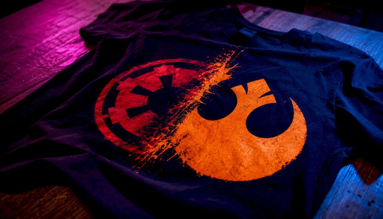
Location and faction palettes pair naturally because Star Wars already built that logic into the films. Mustafar’s lava orange against First Order black recreates the tone of a pivotal duel without needing any actual imagery from the scene. Tatooine sand under Jedi blue evokes the quiet, hopeful tone of a desert moisture farm rather than a battlefield.
Stick to a simple ratio: roughly 60% dominant palette, 30% secondary, 10% accent. Skip a third full palette in the same piece since it usually reads as visual noise rather than a deliberate mash-up. If you’re designing apparel, remember the base garment color counts as part of your palette too. A black tee already supplies your “Empire” tone before ink even hits the fabric, so plan your printed colors as the accent layer rather than trying to recreate a full four-color scheme on top of it.
When in doubt, lean on the film’s own restraint. The original trilogy rarely used more than two saturated colors in a single frame, reserving brightness for the moment that mattered most.
A Practical Note on Fan Apparel
These palettes work best as starting points, not finished art. On a tri-blend tee, a muted Jedi base with one saturated accent prints cleaner than a full four-color scheme, since ink opacity shifts how yellows and reds read against heather fabric versus flat cotton. Test before you commit to a print run.
Start with Simple Tee’s Rebel Forever tee if you want to see high-contrast Rebel orange against dark fabric done right, or browse the Tatooine design for a warmer, sand-based approach. Both show how these hex codes translate once they hit real cotton instead of a screen.
Frequently Asked Questions
What’s the official hex code for the Star Wars logo?
The logo uses Solid Yellow #FFE81F (RGB 255, 232, 31) against black #000000, confirmed as the standard brand value rather than a fan approximation.
Are Jedi and Sith color palettes officially documented by Lucasfilm?
No. Jedi and Sith palettes are approximations designers pull from film stills and production photos, since Lucasfilm hasn’t published an official color guide for factions.
What hex code should I use for a Darksaber design?
There’s no clean single hex for the Darksaber because its blade is flat black with a thin white glow outline. Most designers build it as a layered effect rather than a flat fill.
Can I use these Star Wars color schemes commercially?
The colors themselves aren’t trademarked, but using them alongside Star Wars imagery, names, or logos for commercial products typically requires licensing. Treat these palettes as inspiration for original fan art rather than a shortcut around trademark rules.
Which tool is best for exporting Star Wars color palettes?
Adobe Color handles ASE export well for professional design software, Coolors is fastest for quick shareable palettes, and SchemeColor is the most reliable source for the confirmed logo values.
Sources
- Doug Chiang’s 4 principles of Star Wars design
- Star Wars Logo Colors with Hex & RGB Codes
- Roger Christian on forging the lightsaber, Han’s blaster and more from Star Wars: A New Hope
- The Evolution of Color in Star Wars: A Visual Journey Through Iconic Palettes and Symbolism
- Galactic Style Guide – Color I – Living History in the Star Wars Galaxy